Kitchen design
Two-tone kitchen cabinets
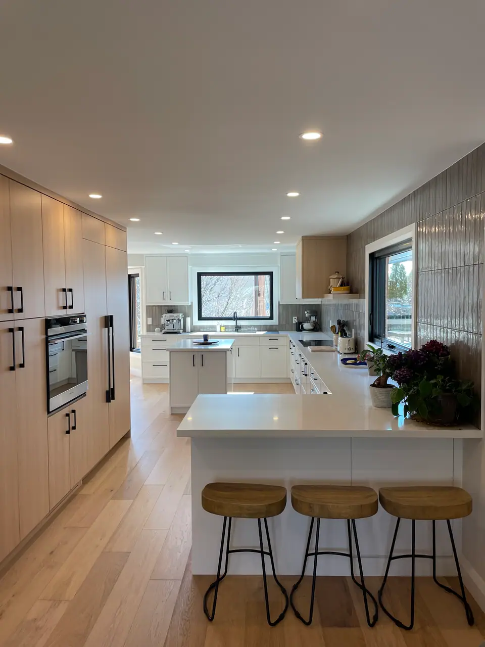
Two-tone kitchen cabinets use two cabinet finishes on purpose, most often split between the island and the perimeter, between upper and lower cabinets, or between a tall pantry wall and the working runs. The pairing works when the split follows a real break in the room, when the two finishes differ clearly in lightness, and when one finish leads while the other supports. Decide where the line goes first, then the pair, then one hardware finish that ties both together.
Where to split the colours: four placements that work
Change colour where the architecture already changes: at a corner, an appliance, the end of a run or the gap between island and wall. A colour change in the middle of a straight run, with nothing to explain it, tends to look like an ordering mistake.
- Avoid a third cabinet colour on top of a two-tone perimeter and island; it is hard to make three look planned.
- Avoid different door styles on the two finishes unless the contrast is the point.
- Avoid ending a colour on a cabinet that is not at a corner, an appliance or the end of a run.
| Split | How it reads | Practical note |
|---|---|---|
| Island in the second finish | The island becomes a piece of furniture in the room | The easiest split to get right, and the easiest to refinish later |
| Lighter uppers, deeper lowers | Eye level stays bright and the room gets a base | Deep paint hides toe-kick grime but shows chips as a lighter base |
| Tall wall in the second finish | Pantry and appliance towers read as one block of millwork | Works when the tall units stand together, not scattered |
| One accent zone | A coffee bar, hutch or glass-front run in the accent finish | Keep it to one zone so it looks planned |
How much contrast: compare light reflectance values
Paint makers publish a light reflectance value (LRV) for each colour, often printed on the chip: a percentage from near 0 for black to near 100 for the brightest white. It is the most useful number in a two-tone plan because it measures lightness, which is what the eye reads from across a room, rather than hue. A sage and a grey with similar LRVs look close at a distance; a sage and a white 40 points apart read as two colours.
For a measurable threshold, borrow one from accessibility. The British standard BS 8300 treats two surfaces as adequately contrasting when their LRVs differ by at least 30 points. Pairs closer than that read as tone-on-tone, subtle and calm; pairs 30 or more apart read as a deliberate two-tone. Contrast also helps people with low vision, a point Canada Mortgage and Housing Corporation makes about thresholds and switches, and the same logic applies to a counter edge against the cabinets below it; see accessible kitchen design for aging in place.
- Compare LRVs first, then paint large samples, at least the size of a door, and look at them at night under the lighting you plan to install.
- Check the pair against the floor and counter, which are the third and fourth tones in the room.
- For a wood and paint pair, compare the paint chip with a finished wood door sample, not raw lumber.
Wood and paint together: what changes with each
The most common pairing in a renovation is natural wood with paint: a white oak island with painted perimeter cabinets, or wood lowers under painted uppers. The two finishes wear differently. Fine Homebuilding's cabinet buyer's guide notes that painted surfaces are somewhat less durable than clear finishes and show small joint gaps more readily, while most factory clear finishes are a hard, catalysed conversion varnish. Put paint where it takes fewer knocks, or accept the occasional touch-up; painted kitchen cabinets covers care and repairs.
Wood also moves in colour while paint barely does. The Wood Database describes most woods darkening toward a settled colour over time, counts oak among the woods that get better with age, and notes that UV light shifts the colour of some species. So the pair you approve on day one will drift a little over the first years. Choose the paint against an aged wood sample if the supplier has one, and see white oak and walnut kitchen cabinets for how each species behaves.
Pairings that hold together, and what ties them
A two-tone kitchen has more than two colours in it: the floor, the counter, the backsplash and the metal finishes all count. Choose the cabinet pair with those samples on the table.
- Keep to two cabinet finishes and one main metal.
- Let the stronger finish cover fewer, larger surfaces: an island or a tall wall, not every third door.
- For colours that age well, see kitchen colour schemes that last; for deep tones, dark kitchen cabinet design.
| Lead finish | Second finish | What ties them together |
|---|---|---|
| Warm white paint | White oak or walnut island | The wood repeated in shelves or flooring; one warm metal |
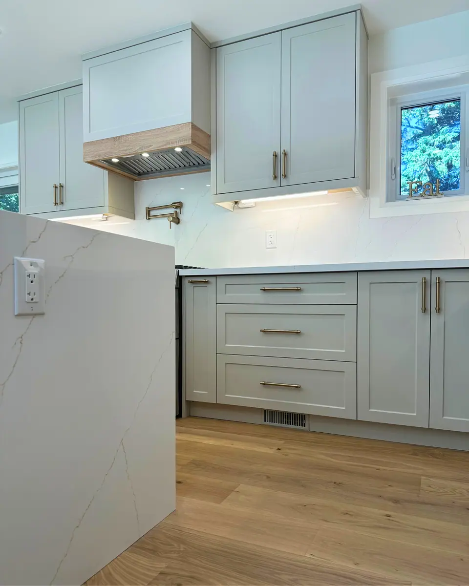
| Sage or soft green paint | Natural wood or a pale counter | Brass or another warm metal; wood floors |
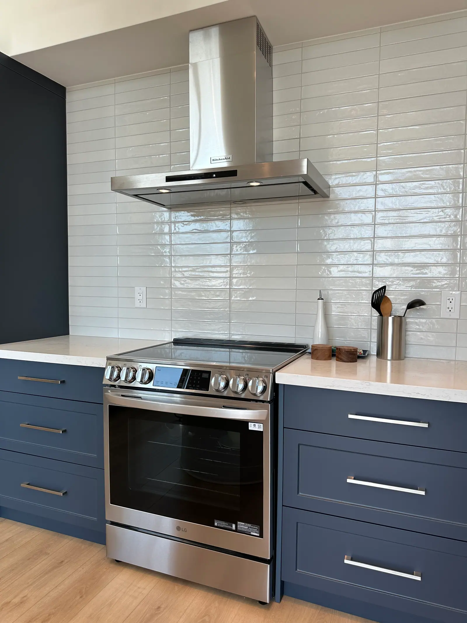
| Deep blue paint | White or pale stone-look surfaces | A single metal, polished nickel or brass, used everywhere |
| Charcoal or black lowers | Pale uppers or open wood shelves | Black or bronze hardware that reads on both |
| Two whites or two greys | Tone-on-tone, well under 30 LRV points apart | Texture: wood grain, stone veining, matte against satin |
Two Toronto kitchens built around colour
In the sage green kitchen renovation in Toronto, sage cabinets sit under vaulted ceilings with new sightlines, brass pendants, white oak floors and a quartz waterfall island. The lesson for a two-tone plan is that the supporting tones do not have to be paint: oak underfoot, brass overhead and a stone island give a coloured kitchen its contrast.
The condo kitchen with city views in Toronto is a bold blue custom kitchen designed around floor-to-ceiling windows, with 12 feet of custom millwork and tall blue shaker pantry cabinets. It shows where a strong colour is easiest to live with: on large, simple, tall planes of millwork set against glass, rather than scattered across small fronts.
Details to settle before the cabinets are ordered
Two finishes double the number of small colour decisions, and most of them are made once and never revisited.
- Give every part a colour on the drawings: end panels, fillers, toe kicks, crown, light rail, the back of the island and the inside of glass-front cabinets.
- Keep one door style across both finishes unless the change is deliberate; kitchen cabinet door styles explains the choices.
- Match the sheen or vary it on purpose; a satin and a matte in the same colour read as two finishes.
- Approve both finishes on real door samples from the same production line, side by side.
- Choose one hardware finish for both tones; pulls sized and placed the same way across the room keep the split from looking accidental. See kitchen cabinet hardware and soft-close hinges.
- Ask for the second finish as its own line on the quote, so you can see what it adds.
Questions
Should the upper or lower cabinets be the darker colour?
Usually the lowers. Darker base cabinets anchor the room and keep the lighter colour at eye level, where it reflects light. Reverse it only when there are few uppers or the ceiling is high enough to carry a darker band.
Can I paint just the island a different colour later?
Yes, which is one reason island-only two-tone is popular. A factory finish is hard to match on site, so refinish the whole island at once or order new doors and panels in the new colour rather than touching up a few fronts.
Do two-tone cabinets cost more?
It depends on the second finish. Another paint colour from the same cabinet line may change little, while a second material, such as a wood-veneer island in a painted kitchen, is a different door product with its own finishing process. Ask for the second finish to be priced as its own line.
What colour should the toe kicks and end panels be?
Match each to the cabinets it belongs to: island toe kicks and panels in the island finish, perimeter ones in the perimeter finish. A tall end panel should match the tall unit it finishes, not the run beside it.
Sources and further reading
- Light reflectance value (BS 8300 contrast threshold), Wikipedia
- Canada Mortgage and Housing Corporation: Low and no cost modifications for accessibility
- Fine Homebuilding: A Buyer's Guide to Kitchen Cabinets
- The Wood Database: Preventing color changes in exotic woods
Checked November 19, 2026. Codes, by-laws, prices and product specifications change; confirm with your municipality, condo corporation or supplier before you build.
Keep reading
Related guides